As we step into 2025, the world of interior design is embracing a rich and diverse palette of paint colors that reflect both personal expression and broader cultural trends. From earthy browns to bold reds and deep purples, this year’s top hues offer something for every taste and style. In this comprehensive guide, we’ll explore the standout paint colors of 2025, delve into the inspiration behind each shade, and provide practical tips on how to incorporate them into your home.
Pantone’s Color of the Year: Mocha Mousse (17-1230)
Pantone has selected Mocha Mousse (17-1230) as its Color of the Year for 2025. This luxurious, subtle brown exudes warmth and comfort, making it an excellent choice for creating cozy and inviting spaces. The earth tone pairs well with floral colors like sage green, dusty pink, and cornflower blue, or similar natural tan and nude hues. Its warm undertones create a cozy ambiance, making it an excellent choice for living rooms, bedrooms, and even home offices.
Inspiration Behind Mocha Mousse
Mocha Mousse draws inspiration from the natural world, evoking the rich tones of earth and wood. This connection to nature reflects a growing desire for tranquility and grounding in our living spaces. The color’s indulgent and comforting qualities make it a perfect backdrop for relaxation and reflection.
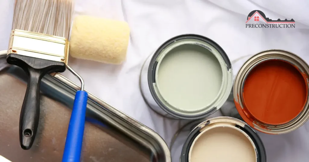
Vaughan Preconstruction Properties offer excellent investment opportunities in one of Ontario’s fastest-growing cities.
Incorporating Mocha Mousse into Your Home
Living Rooms: Use Mocha Mousse on accent walls to create a focal point that adds depth and warmth. Pair it with neutral furnishings and add pops of color through accessories like throw pillows and artwork.
Bedrooms: Create a serene and cozy atmosphere by painting the walls in Mocha Mousse. Complement the color with bedding in soft creams or muted floral patterns.
Home Offices: Enhance concentration and comfort by incorporating Mocha Mousse on a feature wall. Balance the richness with light-colored furniture and ample natural light.
Stay updated with the latest trends in the Canada Real Estate Market for smarter investment decisions.
Behr’s Color of the Year: Rumors (MQ1-15)
Behr introduces Rumors (MQ1-15), a bold and deep ruby red that makes a striking statement. Warm and rich, Rumors offers a dramatic yet inviting touch, effortlessly balancing vibrancy with sophistication. Its versatility allows it to be paired with both warm and cool tones, creating depth and contrast in any space.
Inspiration Behind Rumors
Rumors is inspired by the timeless allure of ruby gemstones and the passion they represent. This color embodies confidence and energy, reflecting a desire for spaces that inspire and invigorate.
Incorporating Rumors into Your Home
Dining Rooms: Create an intimate and luxurious dining experience by painting the walls in Rumors. Pair with dark wood furniture and gold accents for a cohesive look.
Entryways: Make a memorable first impression by using Rumors in your entryway. Balance the bold color with neutral flooring and minimalist decor.
Accent Features: Apply Rumors to ceilings, baseboards, and moldings for an unexpected yet stylish pop of color that adds character to any room.
Explore exceptional homes and properties through Vaughan ON Real Estate for a better living experience.
Benjamin Moore’s Color of the Year: Cinnamon Slate (2113-40)
Benjamin Moore presents Cinnamon Slate (2113-40), a heathered, dusty, and velvet-like shade that is a sophisticated fusion of earthy browns with subtle plum undertones. This rich, nuanced color exudes warmth and comfort, making it a perfect choice for those looking to create a cozy yet refined atmosphere.
Inspiration Behind Cinnamon Slate
Cinnamon Slate is inspired by the comforting spices and the natural aging of materials over time. It reflects a desire for authenticity and a connection to the past, bringing a sense of history and depth to modern interiors.
Get valuable insights and updates from the Wedu Real Estate Blog to stay informed about market changes.
Incorporating Cinnamon Slate into Your Home
Living Rooms: Use Cinnamon Slate on all walls to create a warm and enveloping space. Pair with warm browns, soft creams, and muted mauves in furnishings and accessories.
Bedrooms: Create a serene retreat by painting the walls in Cinnamon Slate. Complement with bedding in soft, neutral tones and add texture through knitted throws and cushions.
Dining Rooms: Enhance the dining experience by using Cinnamon Slate on the walls. Pair with wooden furniture and metallic accents for a balanced look.
For professional marketing solutions, Click Media Pro offers innovative services tailored for real estate.
Valspar’s Color of the Year: Encore (8002-45G)
Valspar introduces Encore (8002-45G), a crisp, cool shade that brings refreshing energy to any space. Under low lighting, its subtle violet undertones add depth, making it an ideal choice for a powder room, basement, or an accent wall. This versatile blue pairs beautifully with cream for softness, rich browns for warmth, or muted sage for a natural touch, creating a balanced and sophisticated color palette.
Inspiration Behind Encore
Encore is inspired by the serene qualities of water and the sky, evoking a sense of calm and clarity. This color reflects a desire for tranquility and a connection to nature within our living spaces.
Incorporating Encore into Your Home
Bathrooms: Create a spa-like atmosphere by painting the walls in Encore. Pair with white fixtures and natural materials like wood and stone.
Kitchens: Use Encore on cabinetry to add a refreshing touch to your kitchen. Complement with brass hardware and neutral countertops.
Accent Walls: Add depth to living spaces by incorporating an Encore accent wall. Balance with light-colored furnishings and decor.
Glidden’s Color of the Year: Purple Basil (1046-7)
Glidden introduces Purple Basil, a statement-making hue that embraces maximalism and self-expression. This deep, sophisticated purple draws inspiration from retro palettes and bold pastels, offering a modern twist on nostalgic aesthetics. Its versatility allows it to shine in both vibrant and understated designs, making it a standout choice for the adventurous homeowner.
Inspiration Behind Purple Basil
Purple Basil channels the opulence of rich velvet fabrics and the boldness of retro design. It reflects a desire for individuality and the growing trend of embracing bold, confident hues in interior design.
Incorporating Purple Basil into Your Home
- Living Rooms: Use Purple Basil to create a bold feature wall. Pair it with muted gray-greens and soft blues for balance or gold accents for a luxurious finish.
- Bedrooms: Add drama and elegance by painting your bedroom walls in Purple Basil. Complement it with creamy grays and white furnishings for a sophisticated yet inviting feel.
- Accent Details: Elevate doors, trim, or furniture with a touch of Purple Basil to add depth and intrigue to neutral spaces.
Sherwin-Williams 2025 Color Capsule
To mark the 15th anniversary of its Color of the Year initiative, Sherwin-Williams has curated a dynamic palette featuring nine trending shades: Grounded, Sunbleached, Chartreuse, Bosc Bear, White Snow, Rain Cloud, Clove, Malabar, and Mauve Finery. This versatile collection encourages homeowners to mix and match hues, creating personalized spaces full of depth and dimension.
Inspiration Behind the Color Capsule
Sherwin-Williams’ 2025 Color Capsule reflects the multifaceted nature of modern life, offering shades that range from grounded earth tones to ethereal pastels. The palette embodies a balance between bold creativity and subtle refinement.
Incorporating the Color Capsule into Your Home
- Layered Living Spaces: Combine complementary shades like Grounded and Sunbleached to add dimension to shared areas.
- Kitchens: Use Chartreuse for a vibrant backsplash or island accent, balanced by the calming neutrality of White Snow on walls or cabinetry.
- Bedrooms: Pair warm tones like Clove and Malabar for a cozy and harmonious retreat.
Practical Tips for Choosing the Right Paint Color
- Consider Lighting: Natural and artificial light can alter how a color appears in your space. Test samples on your walls and observe them throughout the day.
- Create a Mood Board: Gather inspiration from magazines, fabric swatches, and color cards to visualize your desired look before committing to a hue.
- Balance Boldness: If you’re experimenting with a dramatic color, balance it with neutral or muted tones in furnishings and decor.
- Focus on Functionality: Choose colors that enhance the purpose of each room. For example, soothing tones like Cinnamon Slate work well in bedrooms, while energizing colors like Rumors are ideal for dining areas.
Conclusion
The top paint colors of 2025 highlight the importance of individuality, connection to nature, and timeless elegance in interior design. From the earthy warmth of Mocha Mousse to the bold confidence of Purple Basil, this year’s palette offers endless possibilities for transforming your home. Whether you prefer a sophisticated retreat or a vibrant statement, these hues provide the perfect foundation for creating spaces that reflect your personal style.
So, as you embark on your home improvement journey, let these trends inspire you to reimagine your spaces, one brushstroke at a time.